The silent psychology of floor plans: turning foot traffic into profit in 2026.
Every square inch of your retail store is a commercial investment. Yet, many retailers arrange their floor plans based on “gut feeling” rather than customer psychology. If your layout doesn’t guide the customer on a journey, you aren’t just losing sales—you’re confusing your visitors.
In 2026, the physical store experience is your biggest advantage over e-commerce. According to Shopify’s Retail Research, a strategic floor plan can increase dwell time by up to 40%, directly correlating to higher average transaction values. Here is how to engineer your space for maximum ROI.
1. The “Power Wall” and the Invariant Right
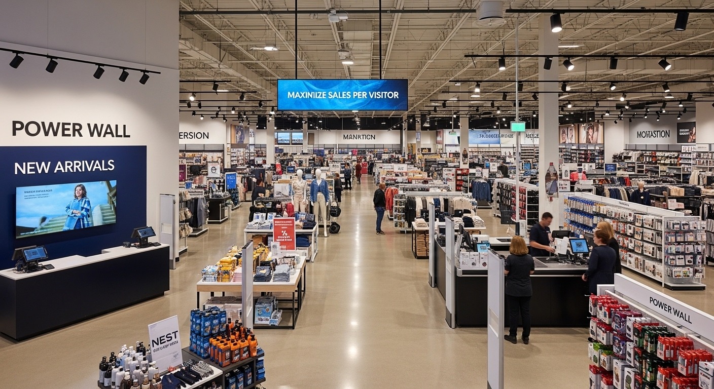
Did you know that 90% of customers automatically turn right upon entering a store? This is a psychological phenomenon known as the **Invariant Right**. The first wall they see is your Power Wall. This is where you must display your highest-margin, most attractive, or newest items.
Think of your Power Wall as your “Hero Banner” on a website. It needs to tell your brand story in three seconds or less. Use high-impact lighting and bold signage to stop them in their tracks before they head deeper into the store.
Choosing Your Strategic Layout
Grid Layout
Maximizes product display. Best for high-volume grocery or convenience.
Loop Layout
Forces a guided path. Ideal for storytelling and maximizing exposure.
Free-Flow
Encourages browsing. Perfect for high-end boutiques and luxury.
2. Creating “Speed Bumps” and Visual Breaks
A long, straight aisle is a sales killer. It leads to “aisle blindness,” where customers walk past products without actually seeing them. To combat this, you need **Speed Bumps**—merchandise displays at the end of aisles or in the middle of a path that force the customer to slow down and look.
Master the Full Retail Success Blueprint
Store layout is only one piece of the profit puzzle. To truly scale, you need a 360-degree marketing roadmap that connects your physical store to a high-converting digital engine.
3. The Checkout Strategy (Point of Purchase)
The area where customers wait to pay is your highest-value real estate for impulse buys. This is where you place low-cost, high-margin items that “solve a problem” or provide a small treat. According to Harvard Business Review, impulse purchases can account for up to 40% of a retailer’s total revenue if the checkout zone is optimized correctly.
| Layout Element | Marketing Goal | Key Metric to Track |
|---|---|---|
| Power Wall | Brand Impression | Attraction Rate |
| Middle Aisles | Exploration | Dwell Time |
| Point of Purchase | AOV Boost | Units Per Transaction |
Final Thoughts
A great retail layout isn’t a static plan; it’s a living experiment. Use heat-mapping tools or simply observe your customers for an hour. Where do they get stuck? Where do they turn around? By optimizing your space for the human experience, you create a store that doesn’t just hold products, but actively sells them.
© 2026 Retail Excellence Insights. All rights reserved.